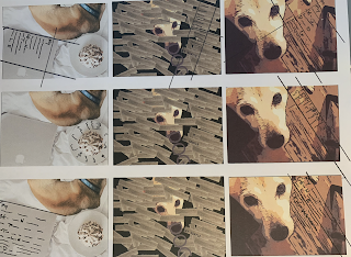
Our Typography 2 class is collaborating with SDSU’s English and Comparative Literature Depart- ment on this Poem Broadside project. Our goal is to successfully design a given poem in a creative and conceptual manner utilizing the broadside format. Poetry International, an organization who publishes poetry anthologies, is also involved in this collaboration. I incorporated using photos and typography. The poem I chose was me thinking about my dog and trying to showcase him and integrate him in to the poem.
The learning outcome:
The learning outcome:
• Expand critical thinking through conceptual and contextual exploration.
• Learn more about print and web typography through research, theory, and practice.
• Develop a broadside with a focused purpose and targeted goal.
• Create and develop visual form in response to communication problems, including principles of visual organization/composition, information hierarchy, symbolic representation, typography, aesthetics, and the construction of meaningful images.
• Describe and respond to audience and context, communicate solutions that address physical, cognitive, cultural, and social human factors that shape design decisions.
• Present work that demonstrates perceptual acuity, conceptual understanding, and systems thinking (including grids—modern and post modern—and proportional systems).
• Explore digital application of conceptual typography; solve inherent legibility challenges.
• Understand and solve the challenge of working with congruent Type + Image relationships.
 |
| The poem of choice |
 |
| Some Drawings to create ideas |
 |
| Some Drawings to create ideas |
 |
| Different Variations |
 |
| Finding Placement for the Type |
 |
| Finding Placement for the Type |
 |
| Once I came up the final idea was trying to make the background seem more realistic This was with a carpet background |
 |
| This was with Grass as the background |
 |
| Grass background with using him in different sizes |
 |
| Using hardwood floor as the background |
 |
| After blending the grass around him to make it look like he was in the grass and not floating. These are the final results Black and White |
The final one in color


